
Ispolink - The Future of Work on Web3
Branding + Identity Design + UX/UI Design + Web Design
Ispolink is a blockchain startup that aims to provide a cutting-edge match making platform that is designed to address one of the most fundamental challenges nowadays: sourcing top talents for the web3 space. Ispolink’s blockchain based product facilitates the processes for filling roles by providing a full cycle recruitment system. The platform makes the entire recruitment process fully transparent and automated. With a detailed idea in mind what the actual product will be, Ispolink needed our services to find out what the core values of the business are, how to reach out to their audience and how their product should look and feel. We created an in deep brand strategy, brand messaging and the corporate identity with brand guide and company logo. After that we created the overall user experience and the user interface of their recruitment platform and helped them planing their metaverse services.

The Challenge
As the adoption of web3 and cryptocurrencies continues, the demand for experts in the spaces grows. Ispolink aims to close the gap between demand and supply for web3 tech talents. They offer a quick, simple, and secure transition into web3 for businesses and tech talents. Before teaming up with Gantz, they had a tremendous business model but a fragile brand strategy and identity and needed to set up the whole structure and design of their product. Solid branding and a strong visual identity would help trigger a wider adoption as the standard for web3 hiring, the go-to recruitment platform for web3 talents and companies.

Brand Strategy
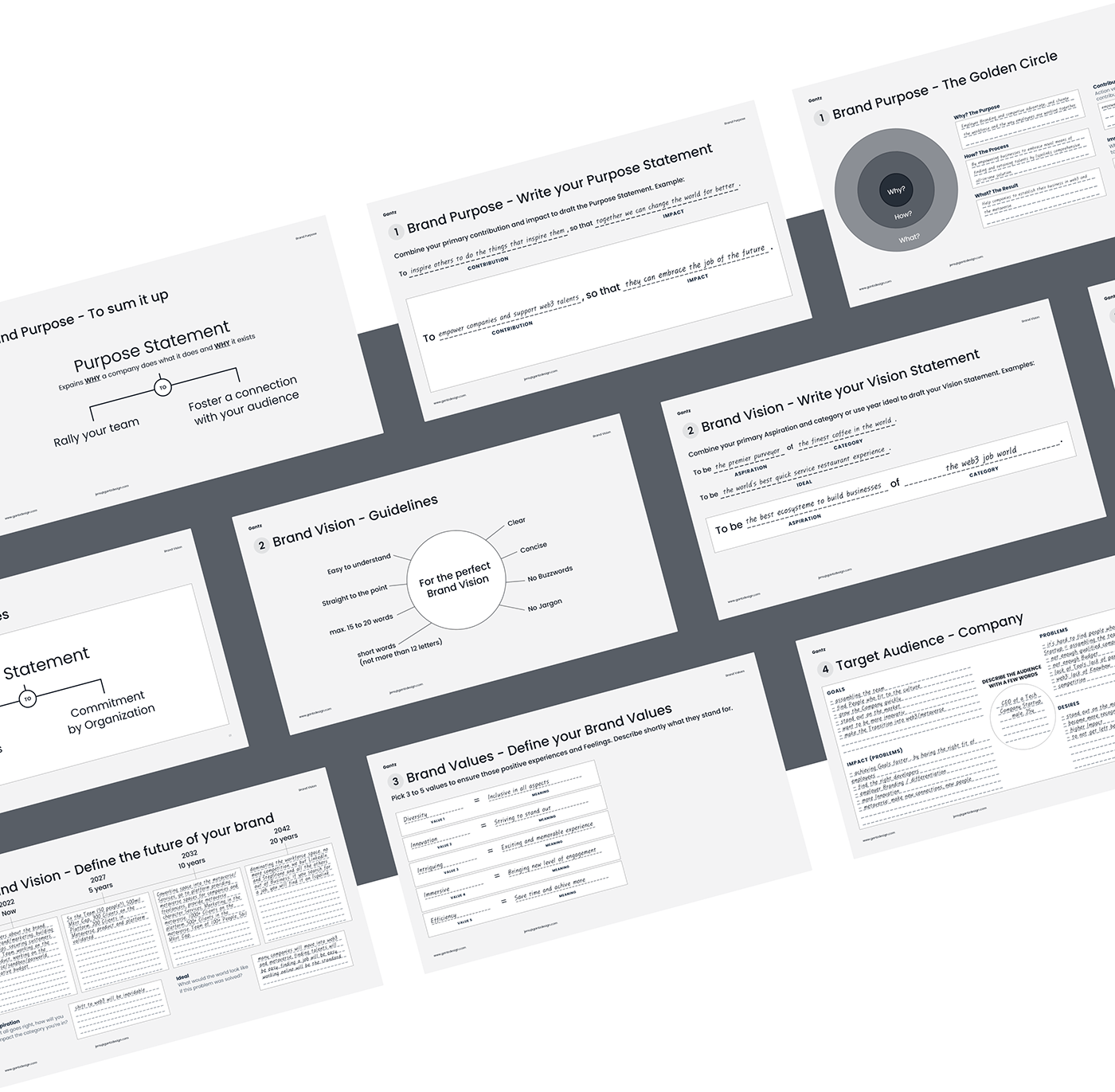
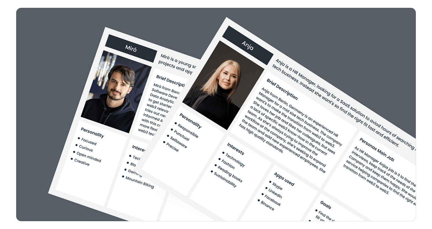
To create a solid brand strategy it was crucial to find out what the basic business values of Ispolink are and how they can be communicated to potential customers. In multiple workshops with the Ispolink team, we developed the brand attributes, user personas and more, using proven design sprint methods and the CORE framework.
Based on the knowledge we gained in the process and in close cooperation with the team, we created a detailed brand strategy and brand messaging. We articulated a clear brand statement and a business vision, defined the core values of the brand, business goals and articulated them in a way their audience can easily understand them.
Based on the knowledge we gained in the process and in close cooperation with the team, we created a detailed brand strategy and brand messaging. We articulated a clear brand statement and a business vision, defined the core values of the brand, business goals and articulated them in a way their audience can easily understand them.


Corporate Design
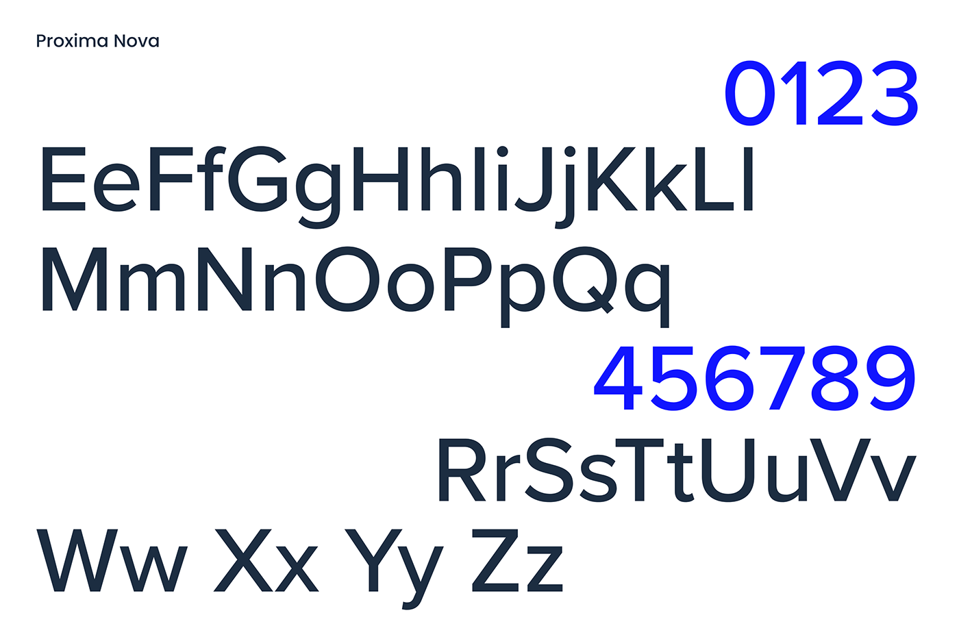
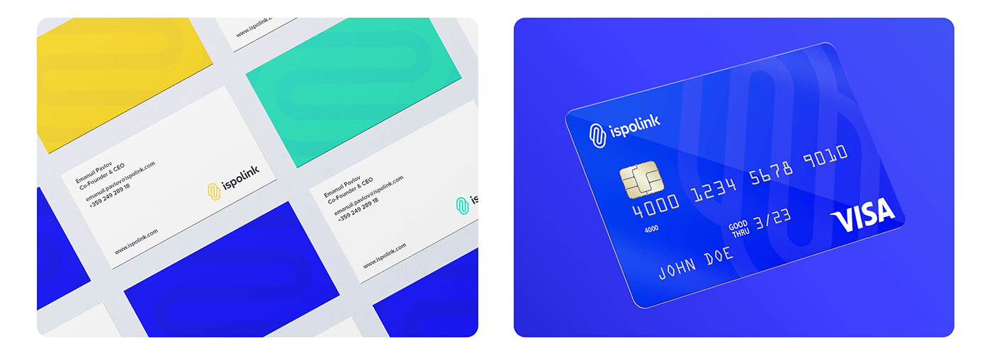
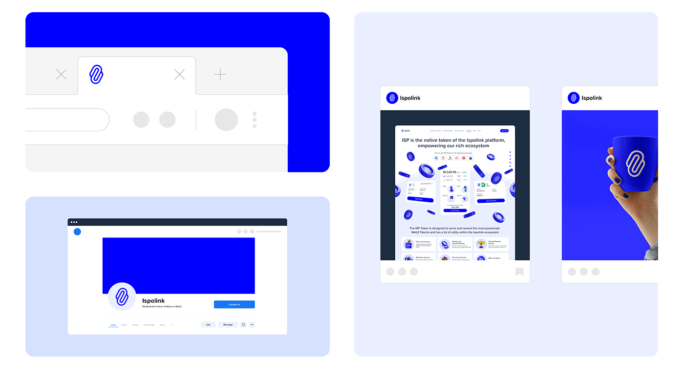
Based on the brand strategy and the brand messaging, we started to setup the visual language for Ispolink. We created multiple logo ideas, color palettes, selected fonts and much more. We also created mockups to show the identity design in action. How could a billboard look like? How does the logo look on a t-shirt? What would be a good layout for a business card? How does the app icon look? Giving some impressions of use cases like that is crucial to find a identity design that fits. While creating a consistent design system, it was especially important that it works for the two different user groups: Job Seekers and Reruiters.


Website
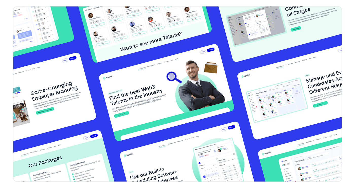
The business website is one of the major touch points of the user journey. It defines if a visitor becomes a customer. Therefore, Ispolinks website needed to communicate clearly the brands vision and messaging, as well as what the products and services offered are and how they can improve the customers lives. In Ispolinks case, it was clear that there are two very different groups of customers: On the one hand web3 talents looking for a job, and on the other hand companies looking for talents to hire. The specific needs of those groups needed to be addressed and communicated in different ways. That's why I decided to use the secondary colors from Ispolinks color palette to clearly separate the content visually. That way the user can quickly distinguish between content for job seekers and companies. I also created subpages for each group to prevent content getting mixed up.


UX Design
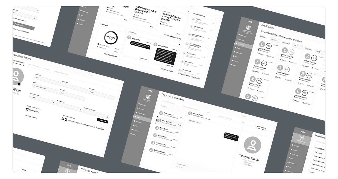
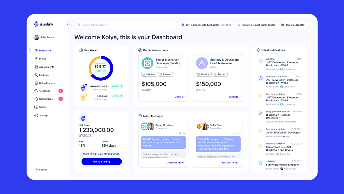
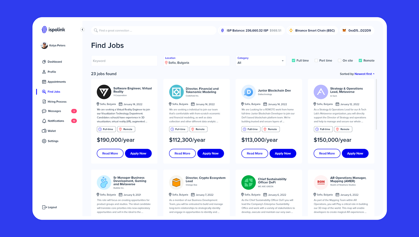
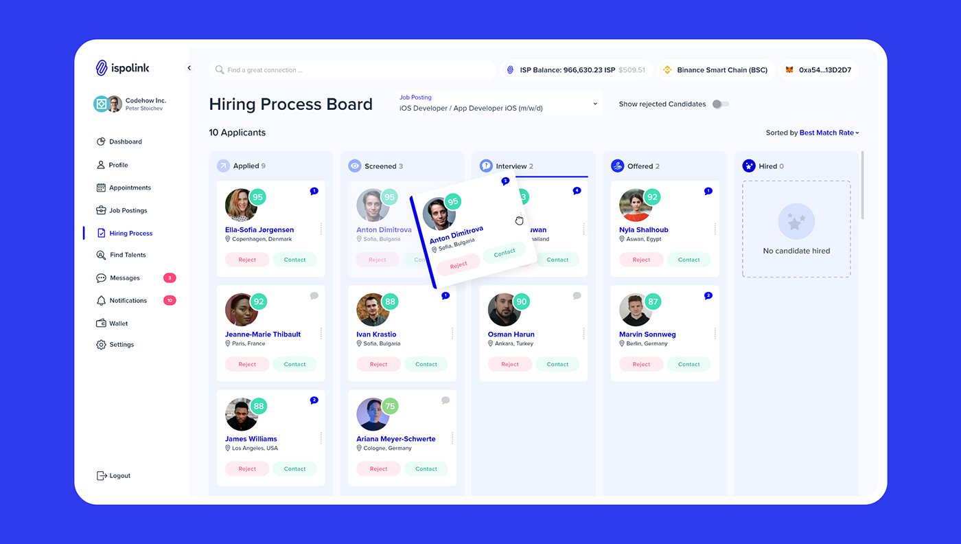
Ispolinks main product is their ATS platform to source tech talents and companies. This is made possible by using a complex AI based match making engine. Making a complex and rich application like the Ispolink platform understandable and easy to use is crucial to provide a great user experience to the customers. In this case, together with the team I created detailed user flows and high fidelity wireframes to structure and connect all aspects and features of the platform properly. It was important to figure out how the user will navigate from point A to B and visualize a basic UI layout. Where do we need a button? Where a checkbox? Does the user interact with X at this point or later on? Is the information read only? Questions like this were answered in this step and build the foundation for the actual UI design.

UI Design
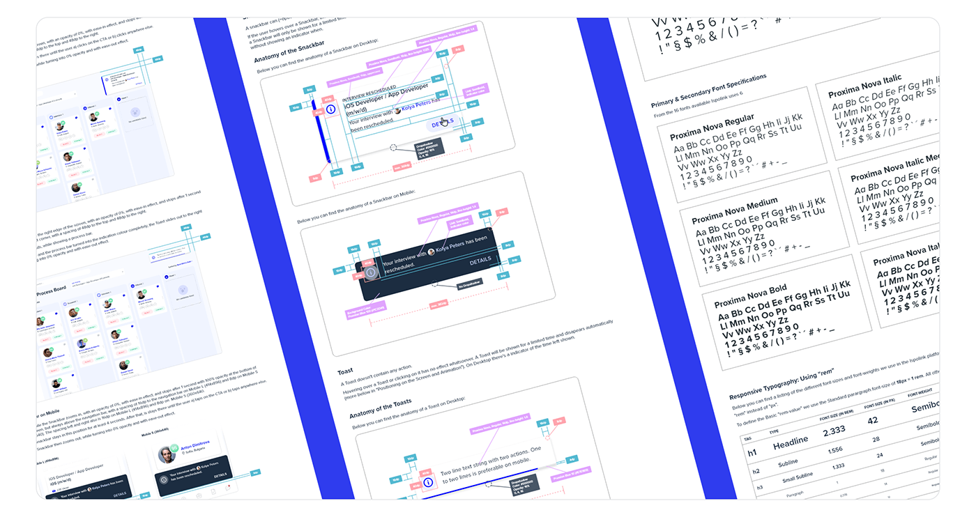
Based on personas, user journey, user flow, wireframes and the corporate design, I created high fildelity mockups representing the final application. They serve as blue prints for the actual development of the platform, visualizing the whole look and feel as well as all features and options of the final product. The goal was to visualize the final application as detailed as possible to allow the actual implementation and development to be handled fast and effortless. The complexity of the application made it necessary to have multiple iterations of every single screen. Overall there were 40+ screens, plus several pop-ups, layovers and notifications needed. As the project it still ongoing, it's likely that there will be more.


Thank you very much
for your attention!
for your attention!
Need something similar?
We're happy to help your business thrive too!
Click HERE to get in touch with us.
We're happy to help your business thrive too!
Click HERE to get in touch with us.

